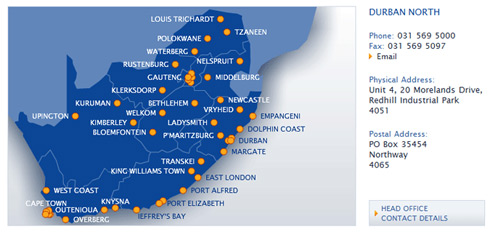
If a business has a number of branches or stores around the country, we’ll often think of using Flash to show the spread of those stores and to link to store details. Now Flash can be good, but it can also irritate website visitors no end, so it’s a good idea to give a quick a run-down of the thinking that goes into using Flash to show store locations – but first let’s get clear what we’re talking about here:
A Flash map is a diagram showing a map of the country or region. It is created in Flash, which is a program for making interactive, animated content on a website. Visitors can click on shapes or labels on the map and the map will transform in some way – either zooming in, or showing some details.
1: Is it making it easier, or more difficult for the user?
This is by far the most important question, because if it takes longer to find what you are looking for using a Flash map than it would using a set of lists, then the Flash must go. If the Flash is allowing users to make less clicks, or it is showing the information more clearly than a list, then the Flash should be used. For Trellidor, we created a map of South Africa, showing the spread of stores. Finding store details using the map takes 1 less click than the drop-down menus (in all cases but Gauteng, Durban and Cape Town).
We were looking at zooming in to each province, to give the dots enough space (especially in Gauteng with is really tiny and always has the most stores or brnaches…) but currently Trellidor has enough stores to fill the national map, but not too many that each province is going to look crowded. They’re also not spreading very rapidly, so this map shouldn’t need to be completely reworked for 3 or 4 years.
2: Making an impression
This is pretty much the point of using a Flash Map. A set of drop-down lists is a simple, clear, universal way of searching by filtering data, so why use Flash? Well, becuase it looks cool.
In Trellidor’s case, we got the dots to spread randomly, giving a quick, simple impression of a good coverage of stores. Aside from that, the Flash doesn’t really do anything special (the map could have been created using Java, or a simple image-map). And that’s kind of OK, because it’s a neat little effect on the page – it makes the site that little bit nicer to visit. It doesn’t take ages to spread the dots, and it doesn’t slow down the page (at 36KB it’s the same size as a static image would be).
Zooming and shifting the map around can also make a big difference to the experience of the site, but point 1 above is far more important, because really, when you’re looking for a store phone number, you’re not looking to have a nice time with an interactive Flash map – you’re just looking for the phone number.
3: People are bad at identifying isolated shapes
Maps get tricky when they need to show a lot of data, because people are bad at recognising shapes when they’re taken out of context. It’s not a big difference, but generally people recognise shapes quicker if they are shown in relation to other recognisable shapes. This makes sense if you think about the ammount of times you have seen the outline of South Africa in compared to the times you’ve seen the outline of KwaZulu-Natal. You instantly recognise South Africa, but the KZN shape isn’t instantaneous – and besides, it’s just really weird-looking.
So we don’t really recommend showing continents, countries or provinces as isloated shapes.
4: What about updating the map?
Well, it can be done, but the general rule is that you can’t place a dot on a map through a content management system (CMS). Adding a new store to the Trellidor map gets done through an XML file – but it’s a quick process, and updating existing store details doesn’t affect the map, so overall it is very manageable from an update point of view.
There are way of getting maps to show data a whole lot more dynamically, although they do require a lot of customisation. Google Maps is a good example:
Google Maps lets you place dots on a map, and then embed the map into your website – I’m not sure how they do it, but its pretty cool that you can drag a dot and drop it onto a map on a website. Google Maps can also be customised to show layers of data, and, using the Trellidor example, you could drop a whole lot of dots onto a Google Map, each with their own store details. The data the Trellidor map has to show just doesn’t warrant that amount of work and customisation.
And the data is definitely the key factor when considering using an interactive map: If an interactive map helps users interact with the data quicker and easier, then its definitely the way to go.
Note: Updated Map (April 2011)
Since writing this post, we’ve reworked the Trellidor Find a Franchise map – the number of stores grew such that we needed to split the map into provinces. This means it takes as many clicks as using the drop-down selectors. But it looks good, and add visual interest to the page, so it is still there. Have a look at the updated map.


Good article. Many smart phones don’t support Flash. So, if your website gets a lot of mobile traffic you should redirect them or offer a link so that the site is still navigatable.
Also, I think you should mention that XML files can be created and customized using a number of scripting languages like PHP. You don’t have to manually change the XML file. You can have PHP create the XML file every so often as the information in your database changes.
Hi Chris, Thanks for the feedback.
Your Flash USA Map is a great looking product – and it’s a good idea to offer an out-the-box solution like that.
You’re quite right about the PHP writing to the XML. The tricky bit is placing a new dot on the map dynamically – getting the Flash to convert a set of GPS co-ordinates to a set of XY co-ordinates that relate to the map. But that can also be done. It would definitely be worth doing if say we were tracking a set of journeys, where the locations would be updated often.
Thanks for the feedback,
Tom